Giant Google technology changes the popular internet browser logo Chrome. Subtle changes will come after eight years, and according to Google Chrome Designer Elvin Hu, will provide “modern experience” products In a long Twitter utas, Hu said changes had been made based on different operating systems emerged. “In ChromeOS, they use brighter colors without gradients to match the appearance of other system icons. In MacOS, they look 3D. For Beta and Dev, we apply colorful ribbons to them,” he said.
The new logo began to multiply from February 4 and is currently available at Crome Canary (browser developer version). It will be launched for everyone over the next few months “We simplify the main brand icons by removing shadows, perfecting proportions and brightening colors, to align with more modern Google brand expressions,” Elvin Hu said.
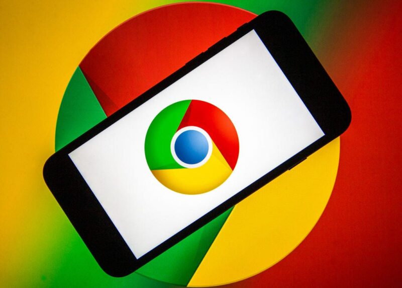
“Fun facts: We also found that placing the nuances of green and red beside each other creating unpleasant color vibrations, so we introduce a very smooth gradient to the main icon to reduce it, making icons more accessible,” he added. Next tweet Because of this change, the blue circle in the middle seems bigger. The colors in the logo also look more excited.
The designer then explains why the changes are very smooth You might ask,” Why bother with STH. very smooth? “We adjust the Chrome experience for each OS, with features such as the original window occlusion on Windows, Day-One M1 support on MacOS, widgets on iOS / Android, and your material on Android. We want our brand to convey the same level of care , “Hu said He then asked for feedback, who would help the team improve the product From 2008 until now, the Chrome logo has been more simple. What starts as a shiny emblem, three dimensions have been trailed to a 2D symbol.